
I owned the navigation design and UX flow for the UL Solutions website relaunch, helping reorganize a large enterprise offering structure around how customers actually look for information.
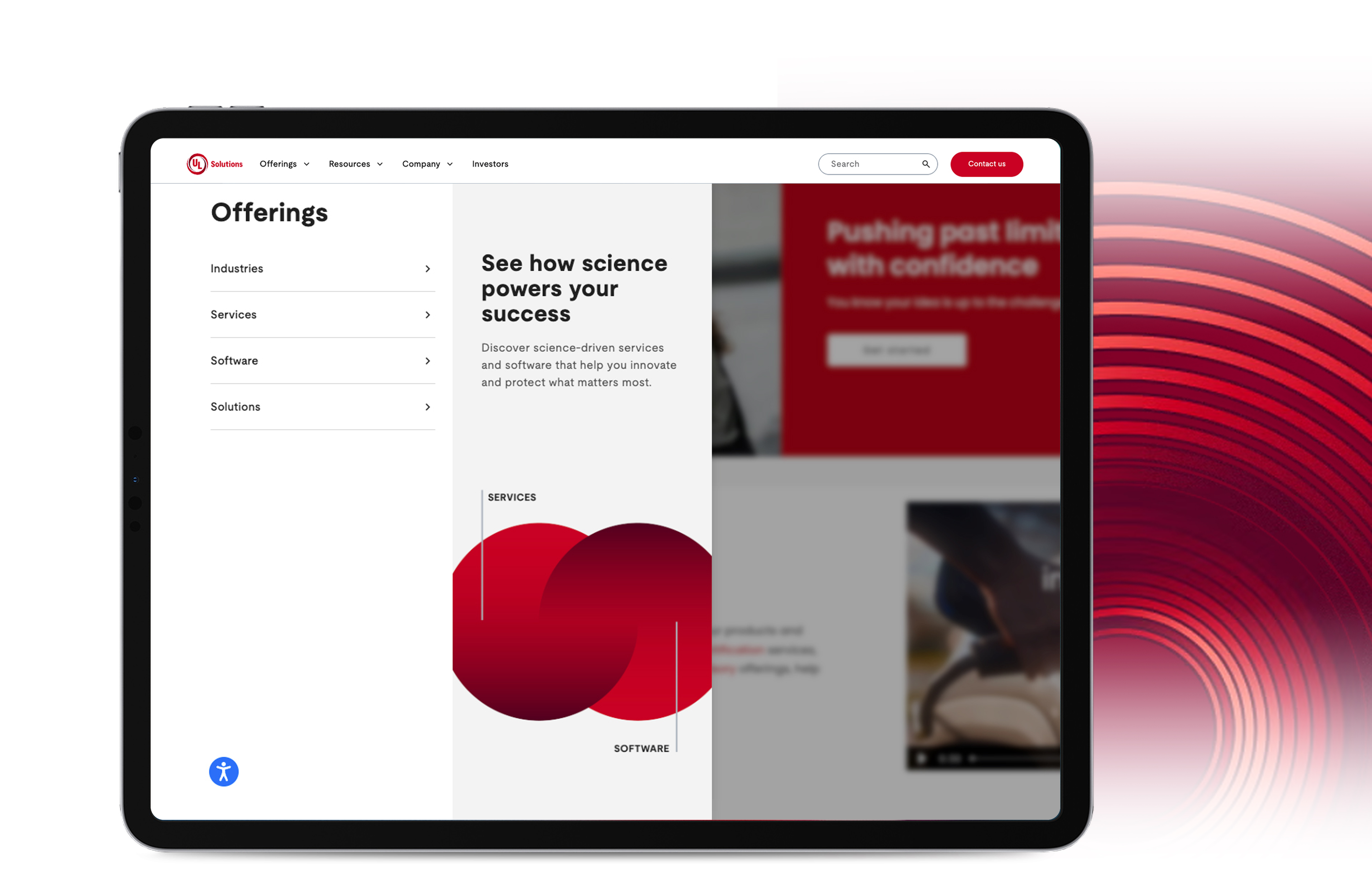
UL Solutions sells across Industries, Services, Software, and Solutions, four ways of describing the same work depending on who's asking. A manufacturing customer thinks in terms of their industry. A compliance officer thinks in terms of a service. Someone already using ULTRUS software thinks in terms of a product name. The old navigation forced everyone into one path regardless of how they actually thought about what they needed, so people were landing on the wrong page and giving up before they found the right one.
My job was the site-wide information architecture and the Offerings mega menu that had to hold all four of those mental models at once, without turning into a wall of links. I owned the navigation design and UX flow. A content lead owned the taxonomy and the site audit underneath it, mapping what already existed before either of us could decide what should replace it.
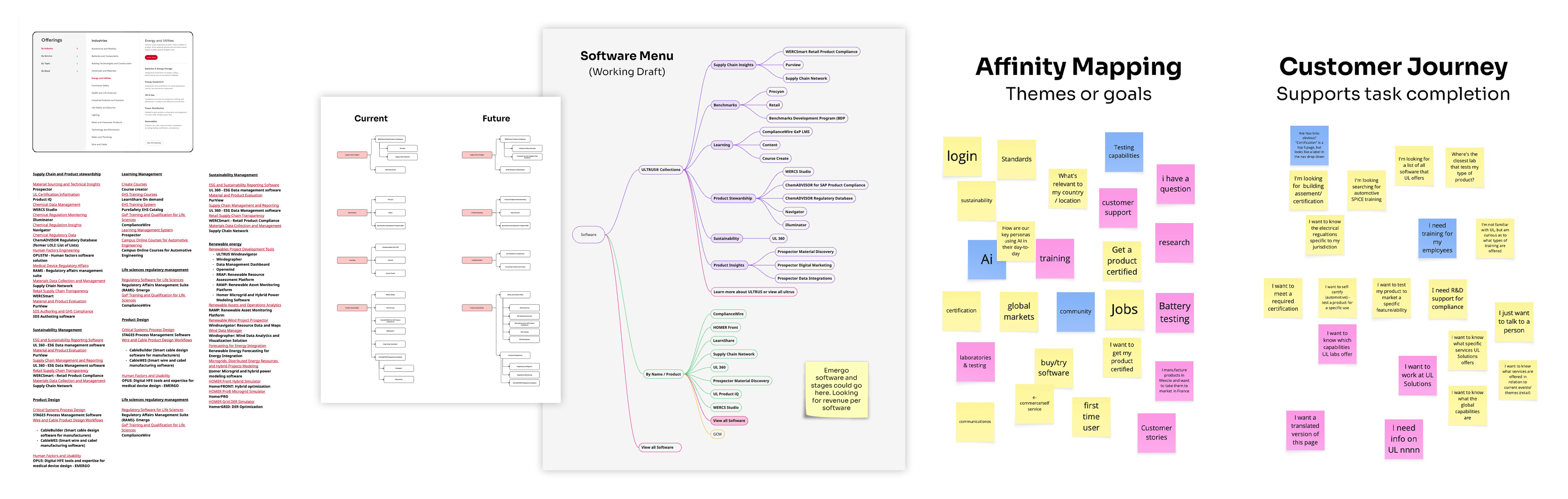
Before any menu structure, we ran an affinity mapping session against the existing content, sorting by theme rather than by department: login, sustainability, AI, training, certification. Alongside it, a customer journey pass tracked what people were actually trying to accomplish at each step, not just what page they landed on. That gap, between how the business was organized and how customers were searching, was the real problem to design around.
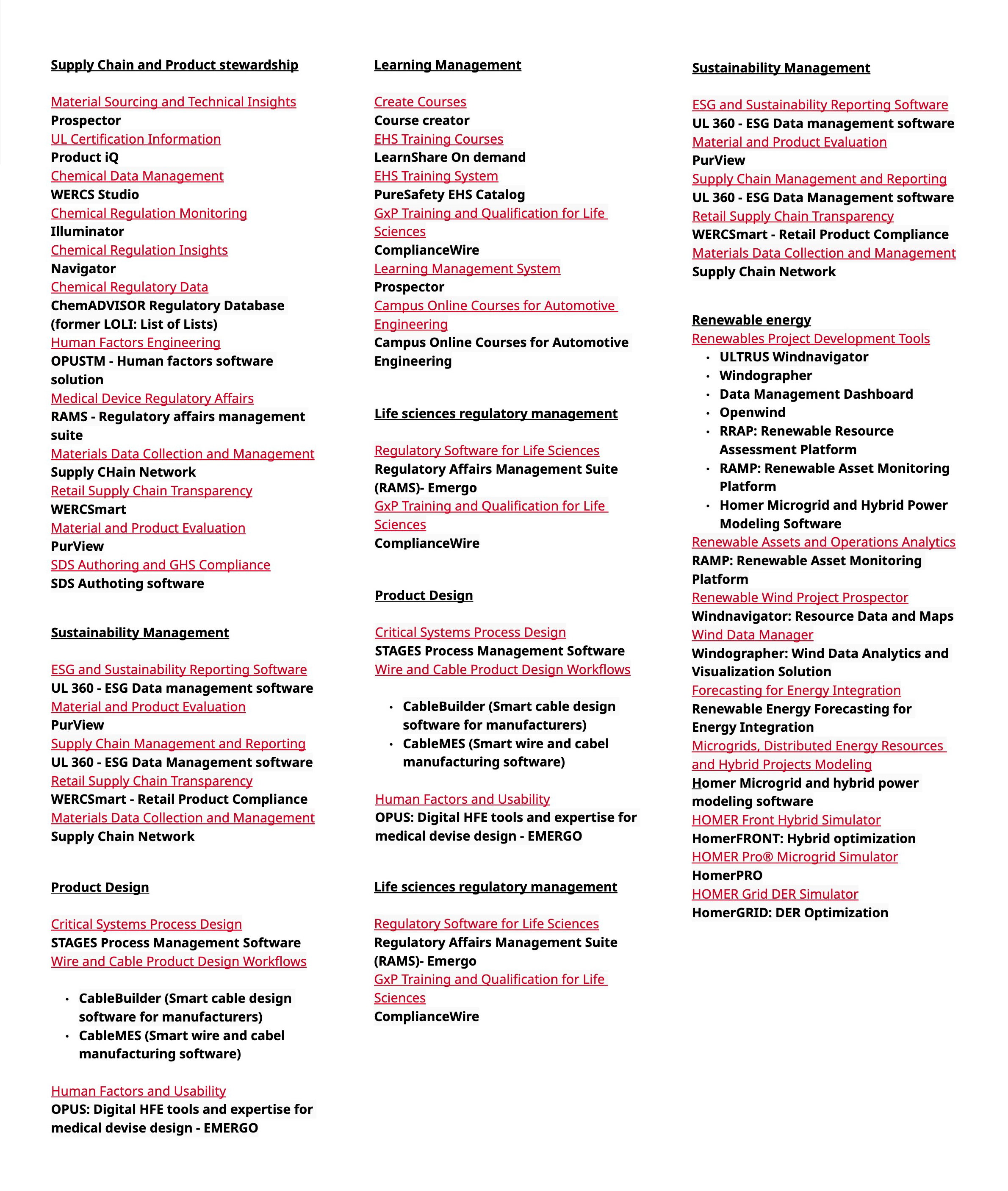
The existing navigation had grown over time. New offerings were added wherever there was room, not necessarily where customers would expect to find them. We compared the current structure with what the navigation needed to support next, using software as the main test case since it had the most overlap and some of the messiest naming.
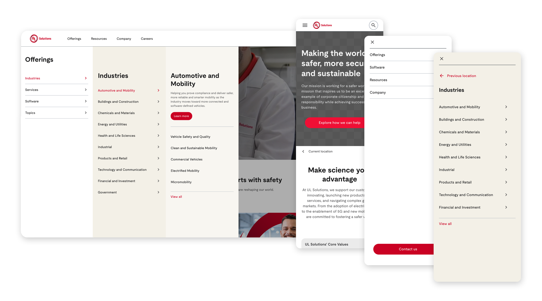
Desktop had room for a three panel drill down. Someone could move from Offerings to Industries to a specific area such as Automotive and Mobility without losing context along the way. On mobile, the same structure became a simpler one level at a time flow. Both versions used the same information architecture so they would stay aligned as content changed.
The navigation launched with the new site and is still in use today. The same structure now carries customers from the homepage into areas such as Software Intensive Systems without requiring them to understand how UL Solutions is organized internally.